
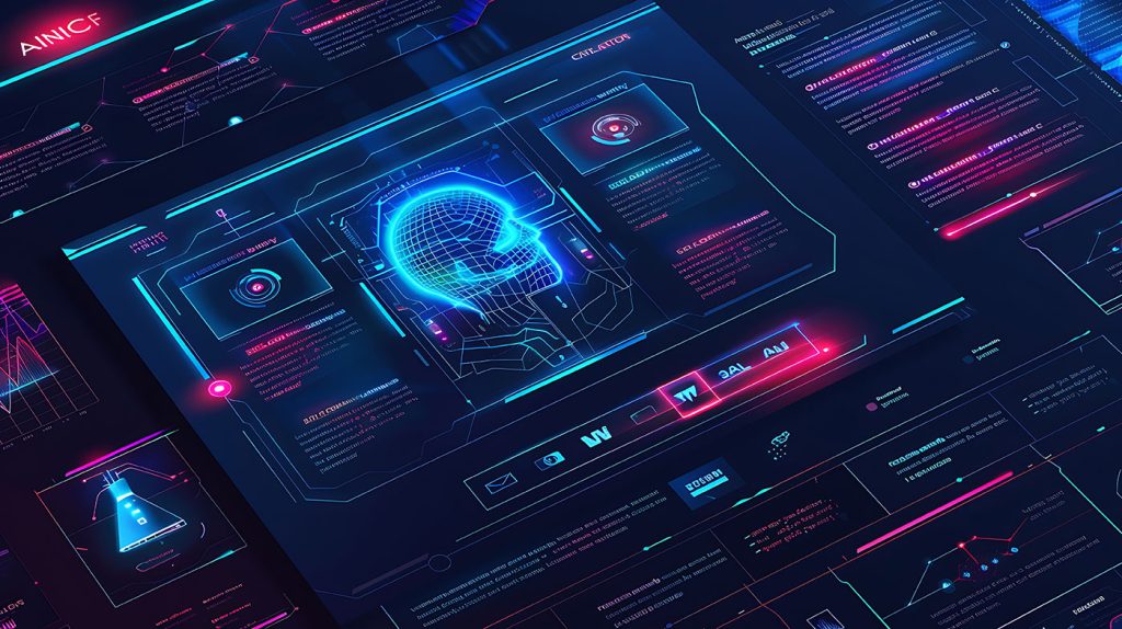
Adobe Cracks Down on Employees’ Generative AI Usage
Adobe Places Restrictions on AI UseNew information from Business Insider reveals that Adobe has instructed its employees not to use personal email acc
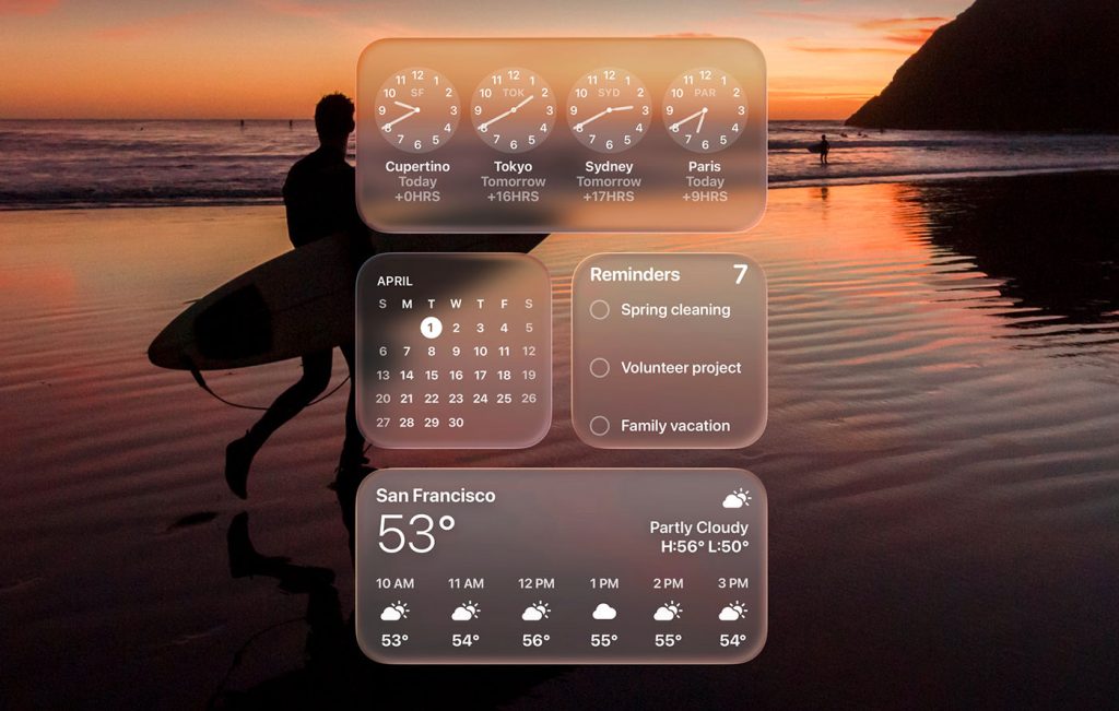
By now, everyone’s talking about Liquid Glass, Apple’s new design language unveiled at WWDC 2025.
At first glance, it looks like another glossy facelift—translucent layers, glowing refractions, and all the visual drama of a perfume ad. But if you’ve been paying attention to Apple’s long love-hate relationship with skeuomorphism, you’ll know this isn’t just an aesthetic refresh.
It’s a full-circle moment—a surprisingly unashamed return to the tactile, material-rich UI Apple once banished.
This time, though, they’ve traded stitched leather and felt for something that looks more like molten acrylic. And while it’s being paraded as the future of interface design, Liquid Glass might just be Apple’s most controversial pivot since the great flattening of iOS 7.
When Apple ditched skeuomorphism over a decade ago, it declared war on ornamentation. Gone were the textures, shadows, and faux 3D surfaces. In came flatness, minimalism, and a whole generation of pastel-on-pastel apps. But now? Liquid Glass is back with depth, sheen, and reactive light behavior.
It’s as if the ghost of Aqua met the spirit of Vision Pro and decided to throw a party inside every screen.
According to Apple, these layers aren’t just pretty—they’re functional. The refractive surfaces are supposed to create focus, guide your attention, and reflect environmental cues.
But make no mistake: this is skeuomorphism in disguise. The materials may be digital, but the philosophy is the same—simulate something tactile to make the interface feel more “real.”
But not everyone’s swooning. Designers and accessibility advocates were quick to point out the obvious: all that pretty glass can quickly turn to mush when layered over complex wallpapers or dynamic content.
Contrast suffers. Legibility collapses. Suddenly, what was meant to feel immersive ends up looking like a smudged touchscreen at a car dealership.
Already, early testers are complaining that buttons disappear, text becomes unreadable, and the UI can feel more decorative than practical.
Which begs the question—who is this design really for? Power users with perfect vision and OLED screens? Because for the rest of us, it’s starting to feel like Apple has traded clarity for dazzle.
And let’s not ignore the timing. Apple’s AI game is behind. While Google, OpenAI, and Microsoft are racing ahead with real-time agents and generative assistants, Siri is still fumbling basic tasks.
So what do you do when your AI isn’t ready? You distract. You shine some Liquid Glass in people’s faces and say, “Look at this! Isn’t it beautiful?”
It’s a clever sleight of hand. While the world waits for Apple’s big AI moment, the company buys itself time by overhauling the interface and selling it as innovation.
But eventually, people are going to realize that layering translucency over Safari tabs isn’t the same as solving actual problems with intelligence. The longer Siri lags, the more performative these redesigns start to feel.
And let’s not forget the developers—those unsung heroes who now have to reengineer their apps to avoid becoming unreadable glass salads.
With Liquid Glass baked into every corner of the Apple ecosystem—from iPhones to CarPlay—devs are under pressure to adapt fast. They’re being told to rethink layering, restructure content, and ensure every shimmering button still makes sense against changing backgrounds.
This isn’t a toggle switch; it’s a deep architectural shift. Developers now have to consider how light behaves, how transparency affects readability, and whether contrast ratios will hold up in the wild.
It’s a level of design anxiety not seen since the iOS 7 overhaul—and it’s going to break a few things before it “just works.”
Here’s the weird twist: Liquid Glass isn’t even honest about what it is. It pretends to be minimalist, but it’s drenched in layers of affectation. This is the UI equivalent of whispering loudly. It wants to appear subtle and elegant while also dazzling you with physics-based depth and dynamic reflections.
Skeuomorphism was once criticized for overwhelming users with too many visual metaphors. It was slow, heavy, and often patronizing.
Now we have its modern cousin—Liquid Glass—which trades stitched leather for simulated plastic, but still carries the same cognitive load. It may be prettier, but it still asks your brain to decode more than necessary.
Let’s be honest: Liquid Glass is stunning. It gives Apple’s ecosystem a unified, modern, almost magical feel. It’s rich, it’s spatial, and it offers a visual coherence that makes everything feel like it belongs to the same world.
But it’s also aesthetic overcompensation. It’s designed to wow in keynotes, not necessarily to serve users in everyday conditions. And it risks alienating users who rely on Apple’s reputation for usability and clarity.
The move is bold—maybe even brave—but it’s also regressive, putting form ahead of function, and asking users to adapt to a new visual language without giving them clear functional gains in return.
Liquid Glass might be the most Apple thing Apple has done in years—beautiful, polarizing, and slightly arrogant. It’s a reminder that even as we inch toward invisible interfaces and AI-driven design, Apple still believes in the power of surfaces.
Whether that belief turns out to be visionary or vain will depend on how this new UI ages—and whether users are willing to trade clarity for glow.
So here we are, once again, watching Apple flirt with the ghost of skeuomorphism. Only this time, it’s less stitched leather and more sci-fi showroom. The question isn’t whether it looks good. It’s whether we needed it at all.
Adobe Places Restrictions on AI UseNew information from Business Insider reveals that Adobe has instructed its employees not to use personal email acc
Web design as we know it is barely recognizable when compared to the first websites that graced the internet in the mid-’90s. From the garish, blink-f
In a recent article, I stated that these were exciting times for Artificial Intelligence. I looked forward to seeing what new developments would bring

User testing used to be a clunky, expensive mess. Remember trying to recruit five “ideal users” who were just available friends of coworkers?Then awkw
Let’s get this out of the way: most websites in one to five years won’t need you. Or me. Or anyone with Figma open and a mood board full of fancy font
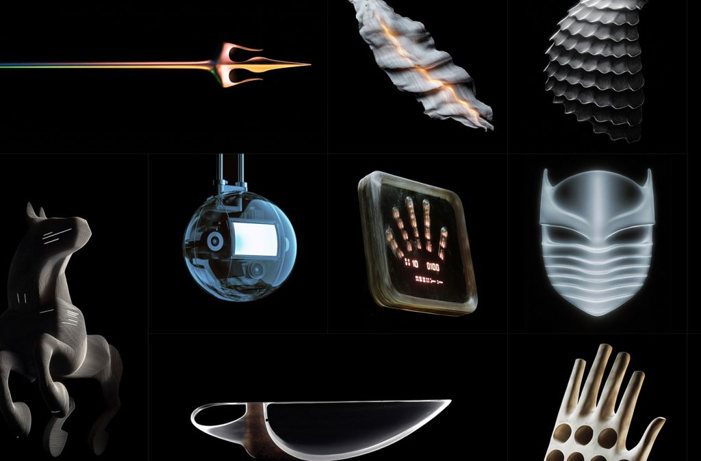
Ever wondered what happens when AI gets creative?Enter Extraordinary Things, a project by Yashas Mitta that brings AI-generated surreal designs to lif
We are an information hub dedicated to delivering clear, trustworthy, and engaging content across a wide spectrum of topics — from innovation and trends to daily life, wellness, and global developments.
Our team is passionate about creating content that helps people stay curious, make informed decisions, and understand the world with greater clarity and context.
With a focus on quality, relevance, and accessibility, we aim to offer a meaningful experience for everyone seeking knowledge, ideas, and thoughtful perspectives.